

I'm pretty much happy with how they turned out except two. Why is it that every embroidery font that comes with a sewing machine has a funky looking I? I mean the capital I's always look like T's to me. What gives? Ugh... What do you think? I wanted it in all caps since I'll have four blocks in caps and four in sentence case.

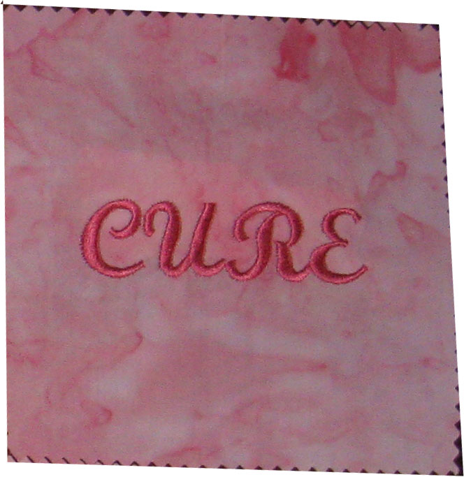
While I am being picky, I'm thinking my capital C looks almost like an E. Instead of CURE, my eyes are seeing EURE. Maybe it's time to push up that eye doctor visit. I may be off to look for new fonts with basic I's and C's to redo these two blocks. I wanted to keep them all in the same font, but, not sure I will.
Thanks for stopping by!
~*~Trish~*~
I agree with what you are saying about the fonts. I feel the same way when I do the "I's" they never look right..I think I would redo those 2. You'll be happier with the outcome..Love your quilt. as a survivor, 6 years, it speaks to my heart!! Good luck!
ReplyDelete